5 simple steps to design irresistibly clickable display ads
If you’re like me, you’ve come to the realization that digital advertising isn’t just a nice addition to the marketing mix, it’s essential for survival. In 2022, adults in the U.S. will spend over eight hours online each day, so if you’re going to reach a new audience with your message, you’re going to have to meet them where they are: online.
But it often feels like there are too many barriers of entry. What software do I use? Well that one’s a little easy: Feathr. All joking aside, we’re going to focus on the other biggest obstacle: how do I design a captivating display ad? We’re going dive into the nuts and bolts of how to design that winning display ad in five simple steps:
- Make a powerful statement about your brand
- Capture attention with distinctive visuals
- “Keep it simple stupid” (KISS), especially with the copy
- Let people know what to do through a call to action
- Design ads with the best, FREE platforms and templates
One note before we begin: We’re going to focus solely on display ads or banner ads in this post, and we’re going to save social ads for another time. These display ads are the types of ads you run into while reading the news or checking the weather online. For example, I almost always run into an ad when I open up merriam-webster.com.
1. Make a powerful statement about your brand
What I really mean here is that you need to start from square one. Whatever design you land on for your ad needs to match your overall brand. This shouldn’t be something that you retroactively build after you’ve started advertising, rather your branding should be the map for how you design your display ads.
The only thing that’s guaranteed by skipping this step is that people are going to receive mixed signals about what you do and what you stand for. If they see different colors, they may just think that it isn’t the same organization, or if you come across in one ad as playful and another as serious, people are going to begin to not know what you’re offering or what to expect when they jump on a call with someone from your team.
Make sure that your organization has clear standards about how you communicate. Always use the same colors and the same voice when building display ads or any other content that you’re going to distribute. Nobody’s going to take you seriously if they think you’re in the midst of an identity crisis.
2. Capture attention with distinctive visuals
Please note that I didn’t say provocative. Your ad shouldn’t be click bait, but it should catch eyes. We understand this sounds like a fine line, but if you’re following your brand guidelines and sending people to the page they’re expecting, you shouldn’t run into any trouble.
You only have one chance to stand out from all the noise around you. Marketing specialists estimate that the typical person is exposed to between 4,000 and 10,000 ads each day. So don’t blow your one opportunity by being overly cautious.
But again, we aren’t recommending anything outrageous. It’s important that this step comes after you define your brand’s voice and graphic style. Your brand guidelines are the ultimate authority on what’s in and out for you, but those rules should always allow you to push the envelope at least a little.

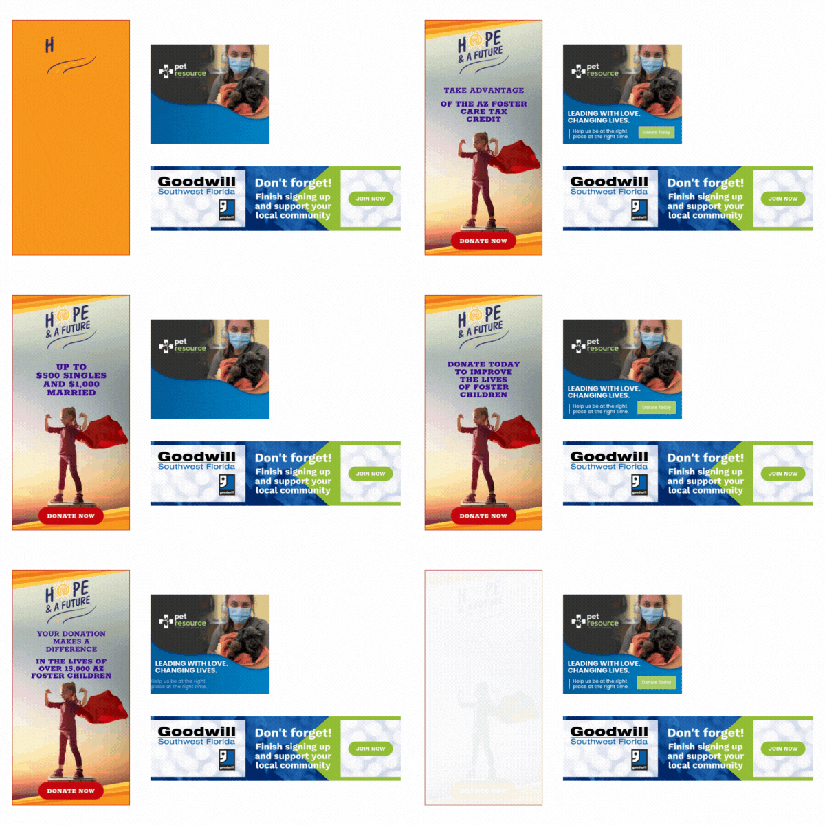
Examples from nonprofits with powerful brands and imagery.
3. “Keep it simple stupid” (KISS), especially with the copy
I feel bad quoting this rule, but I didn’t come up with it, and it is spot on here. Not to get too far off track, but this acronym actually comes from a 1960 U.S. Navy design principle, and part of the need for simplicity was so that repairs could still be made in combat situations with the most basic of tools.
That’s enough history for now, but the idea is still very much applicable when it comes to designing display ads today. You need any person anywhere to know exactly what your organization does and what they’re being asked to do. Complexity and ambiguity are often great in drama or literature, but your online ad, to be perfectly frank, just doesn’t have the space.
So be creative and clever, but in the end just keep it simple, stupid (I’m so sorry, this one just felt mean — but I really didn’t come up with it).
4. Let people know what to do through a call to action
People have an infinite amount of decisions to make when they’re online. There are probably menus on the page they’re currently on with 20 other pages to jump to, or they can even leave your site and start new on Google or switch entirely and check their mail. Maybe they even have a call that’s scheduled.
Because people are overloaded with choices online, your ad should be the simplest choice they have to make all day. If you’re a nonprofit, you probably want them to donate today. If you’re an event organizer, you probably want them to register today. Hopefully, people already know about your organization and what you do, so they know what you’re doing or selling. Either way, it’s honest to simply ask for what it is that you’re looking for. And do this in a very simple call to action within your ad.
We even have a call to action at the end of this article, and you can find even more examples of successful ads here if you’re looking for great ideas specifically on calls to action.

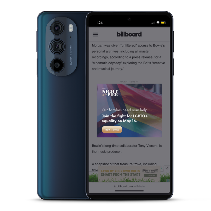
Example of a mobile display ad on Billboard.com with a clear call to action.
5. Design ads with the best, FREE platforms and templates
Instead of giving you a list of the top ten, I’d recommend simply starting work on Canva. Feathr has a built-in designer if you run your ads through our platform, but Canva is easy to export into Feathr or any other platform, and if you’re new to designing ads, they have beautiful templates to help take your ideas to the next level.
If you’re looking for examples of other organizations' ads, you can find thousands of samples at Moat. Just search any brand name and see examples of their digital ads. These can give you a good feel for how others in your industry are communicating their story, and it can act as inspiration for how you craft your own.
Takeaways
The main takeaway from this article should be that you can start designing your display ads today! If your team is still in the process of building out your brand’s visual and content style guides, we recommend you tackle that first. But right after that, start building ads these sizes and get the message out.
You May Also Like
These Related Stories

Ads & email: How to build synergy with omnichannel campaigns

Nonprofit Advertising | Approaches, Examples, and Tips
