
Your nonprofit’s website is one of the most important tools you have at your disposal. It serves as a hub of information for both current and potential supporters, and it’s at the heart of your marketing strategy. Your website also provides many opportunities for supporters to engage with your organization, whether by subscribing to your newsletter, registering for an event, signing up to volunteer, participating in advocacy efforts, or giving online.
According to Loop, the best nonprofit websites provide a streamlined, intuitive user experience while effectively communicating the organization’s mission. If you’re considering updating or optimizing your organization’s website, this combination of user experience and clear messaging can guide your approach.
In this guide, we’ll review four characteristics of optimized nonprofit websites that you can apply to your organization’s online presence. Make sure your website is:
- Easy to navigate
- Mobile responsive
- Consistently branded
- Fully accessible
If you optimize your website in these ways, visitors are more likely to return to it, helping your organization retain their support long-term. Let’s dive in!
1. Easy to navigate
Maintaining intuitive navigation is commonly considered a nonprofit website best practice. A clear, easy-to-use navigation system helps visitors find exactly what they’re looking for when they arrive on your website and encourages them to browse for longer.
Use the main navigation bar, usually found at the top or left side of your website, to direct visitors to core pages such as:
- The homepage
- Your organization’s about page
- Mission-related resources
- Ways to get involved
- Your online donation form
To encourage supporters to donate through your website, use a call-to-action button to link directly to your donation form rather than putting it under a different menu category. However, if you’re wondering how to categorize other information on your website, it’s often helpful to put together a group of volunteers and see how they would organize topics through card sorting or tree testing, as pictured below.
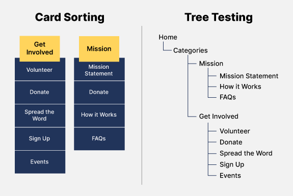
This graphic shows how to perform card sorting and tree testing on a nonprofit website using the categories “Get Involved” and “Mission.”
Once your website is fully built, conduct a final usability test to ensure your navigation system is as easy to use as possible. If your volunteers have difficulty finding any pages you ask them to look for or provide feedback that certain pages should fall under different categories, you can use the results to make any last-minute adjustments to your website before it goes live.
2. Mobile responsive
To make the most of your website, it should be navigable not only on a computer screen, but also on a tablet or smartphone. According to Double the Donation’s fundraising statistics, half of all nonprofit website traffic in 2022 came from mobile devices, emphasizing the importance of designing mobile-optimized websites.
Some ways to make your website more friendly for mobile users include:
- Ensuring all pages resize automatically for smaller screen sizes — using vertical page layouts often solves this problem
- Making buttons large enough that mobile audiences can easily tap them without accidentally clicking through to a page they didn’t intend to.
- Limiting the number of form fields on your online donation page and registration forms to collect only essential information and reduce the need for scrolling.
As the trend of mobile-first communications seems to be here to stay, it’s important to design a website that meets supporters where they likely are — on their smartphones.
3. Consistently branded
No matter what device supporters use to access your website, you’ll make a stronger first impression on them if your website is consistently branded. Branding helps your nonprofit stand out from other similar organizations, makes your marketing materials instantly recognizable, and instills a sense of trust in supporters that makes them more likely to express interest or take action.
When developing your nonprofit’s brand, focus on the following elements:
- Color scheme. As you select brand colors, remember that certain colors are naturally associated with feelings or ideas and therefore might be more suited to your mission. For example, red is a favorite color of many healthcare organizations because it’s associated with strength and passion, while environmental nonprofits often prefer green because of its associations with growth and nature.
- Typography. To add visual variety to your website, consider choosing two brand fonts: one for headings and one for body text. But don’t use more than three typefaces as doing so can create a cluttered look.
- Logo. Use your brand colors and typography to design a simple but memorable logo for your nonprofit. Then, add it to the top left corner of your website’s navigation bar with a link back to your homepage to help it stand out.
- Messaging. Although visuals often come to mind first when discussing branding, your nonprofit’s writing style and tone are just as important to consider. How do you want your organization to come off to new audiences? Do you have a preference for specific grammar or spelling conventions? Are there any words you love (or hate) to use when describing your mission?
Once you’ve decided on these standards, compile them into a single document called a nonprofit brand guide. This way, anyone who works on your website design or other marketing channels has a reference for how to apply each aspect of your organization’s brand. This will ensure you’re telling a cohesive story across all digital channels.
4. Fully accessible
If your nonprofit’s website is truly optimized, everyone who wants to use it should be able to do so easily. This includes individuals with low internet connectivity, as well as those with temporary or permanent disabilities.
To make this possible, ensure your website follows the internationally agreed-upon standards outlined in the Web Content Accessibility Guidelines (WCAG). Some areas to focus on include:
- Adding alternative text to images.If a website visitor uses screen reader technology, it will read out the alt text for each image. Alt text also shows up if low internet bandwidth prevents the image from loading, allowing all visitors to gain value from your photos and graphics.
- Providing transcripts or closed captioning for audio and video content. Having a text-based alternative to content that includes sound helps audience members who are deaf or hard of hearing, as well as those in locations where they can’t turn up their device’s volume.
- Checking for adequate color contrast. To improve readability, especially for colorblind individuals, WCAG standards recommend a contrast ratio of 4.5:1 between a website’s background color and text color.
These accessibility guidelines can also be useful as you create content for other digital marketing channels. For instance, consider captioning the videos you post on social media and checking the color contrast of your email templates to make sure your marketing materials are inclusive of all of your nonprofit’s potential audience members.
Whether your nonprofit is finalizing the first iteration of your website or updating an existing version, keeping these four characteristics in mind will help you optimize your site.
Always prioritize your supporters’ experience on your website as you make design choices. If visitors can easily navigate the site on both desktop and mobile, recognize and trust your brand, and find it accessible no matter their ability or internet connection, they’ll keep coming back again and again!

Digital marketing for nonprofits | A comprehensive guide

16+ Marketing Ideas for Nonprofits | Engage Your Supporters